If you’re using the default UI to raid, PvP, quest, or to just even vendor those grey items you’re doing it horribly and terribly wrong. That’s not understating things either. The default UI is and old and clunky relic of a day gone by.
Even the folks at BioWare took the time to poke fun at it with their pre-set “Retro” UI option, when they introduced a fully customizable UI to SWTOR.
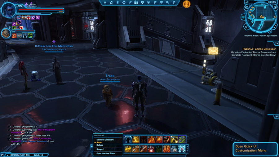
Thankfully we have all sorts of options at our disposal to make it all go away.
The big thing to consider when you create a UI is what you want to get out of it. The basic funtion of a UI of course in input and output, but it’s more complex than that.
You want to be able to easily perform actions. You also want access to information so that you can take the right action at the right time.
The UI is in part a dashboard (think car) that should be feeding you critical information in an easy to find and timely fashion.
Knowing that the boss has 10% health and will be dead in five seconds should be enough information to let you know that casting Heroism is a bad idea and a waste. That never happens right?
With these basic concepts in mind, I set out to redo my UI this past weekend. First a little background on my history with UIs.
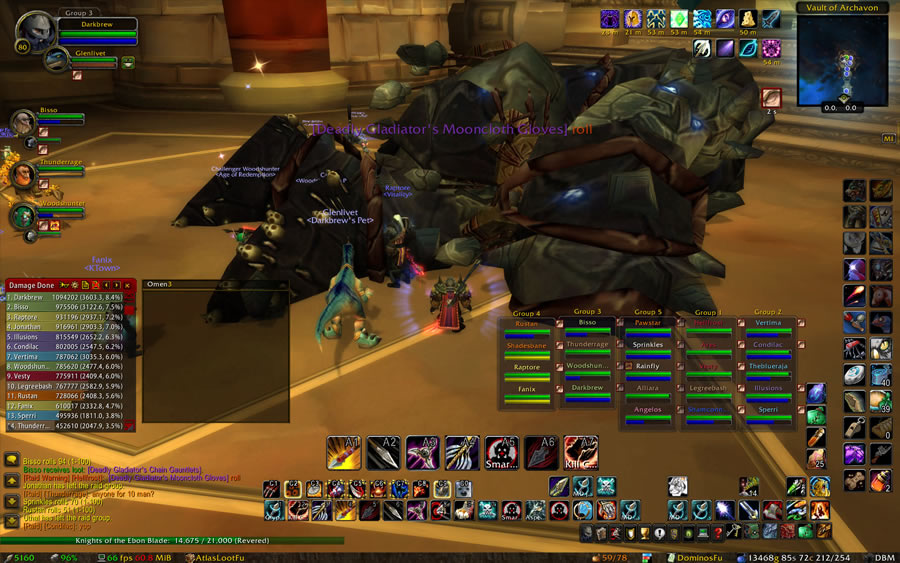
I more or less used the default UI throughout all of Vanilla and Burning Crusade. Yes, I used addons but I didn’t use any toolbar or unit frame addons. It wasn’t until Wrath of the Lich King that I decided to break out the sledgehammer and star tearing down the walls of the default UI. A liberating moment to be sure.
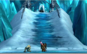
Here’s a look at one of my earliest creations. How I managed top derps with this monstrosity is beyond me.
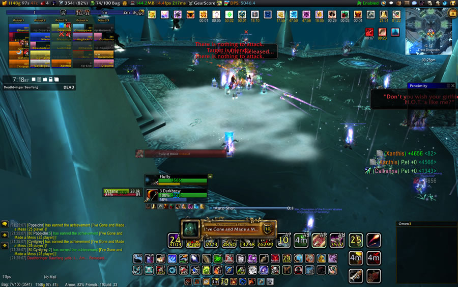
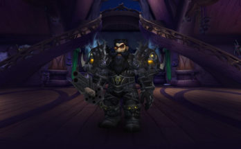
As that expansion wore on my Frankensteined creation continued to evolve, ultimately looking like this.
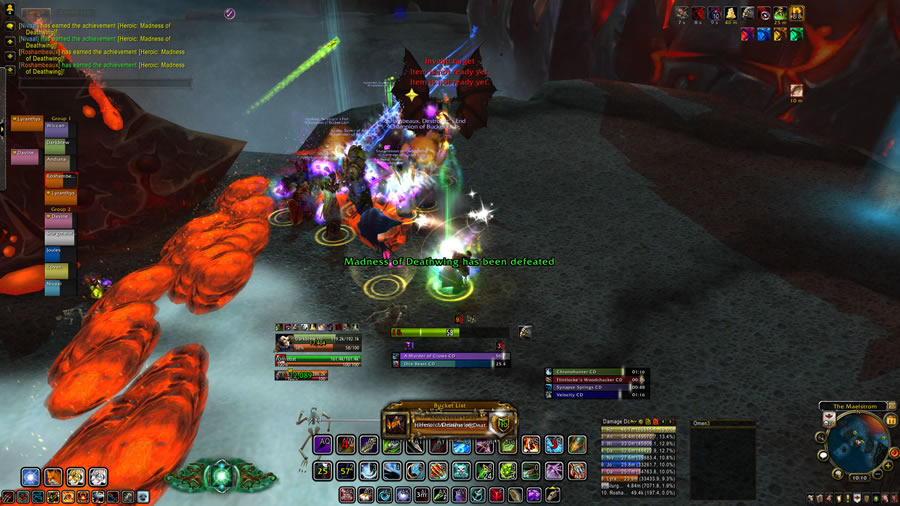
In Cataclysm I went through at least three UI variations. This was my final one. Some steps forward and a few back.
Our Heroic Deathwing kill came around ten days prior to MoP’s release. That’s why you see some of the Mists’ spells.
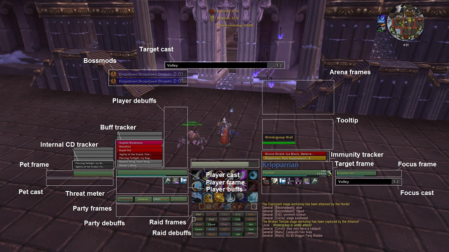
The search for the perfect UI is never ending, and in MoP I decided to take a different approach and that was to find a pre-built package that I could work with. I found that in Kripparian’s UI.
It wasn’t that different from what I had been trying to do, but it was cleaner and more organized, and it was built a by a Hunter for use as a Hunter.
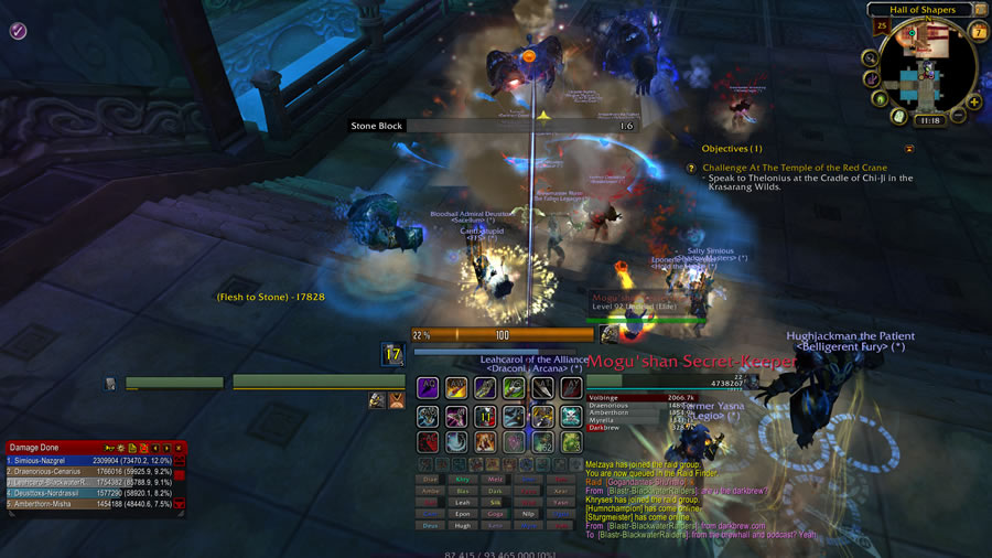
This UI served me well for almost two years, but in the end I found it lacking in several places.
It’s very cluttered. It relies heavily on textual information. The target cast bar was hard to locate in the midst of the action, and there were times I needed to interrupt things and this was a hindrance.
The boss mod messages were also hard to notice in the heat of the battle.
There was a lot I liked about it, but ultimately I wanted to try for better. This has led me to my current incarnation.
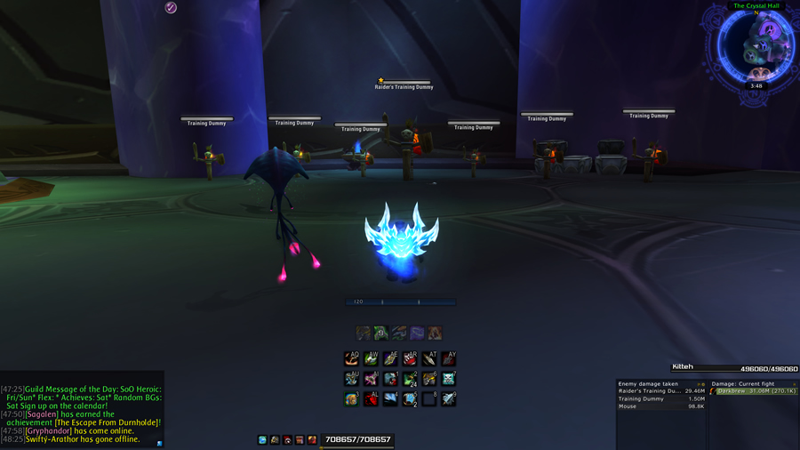
Now when it comes to building a UI there are three basic options. One is to build it entirely from scratch which is what I did in Wrath and Cata.
Second is to find a pre-assembled package, install it and go. This is what I did for Mists.
The third option is to find a pre-assembled package, install it, and then rip out its heart and soul with your own bastardized modifications. This is what I’ve done with my latest UI.
My new UI is a modified version of one created by Jademcian. You can read all about it and download it from here.
Some of you might remember Jade from this guest article he wrote for Eyes of the Beast.
Jade has created a very clean and great looking UI. I love the font, the placement of the BigWigs timers, the party and raid frames, and the use of the scrolling combat text.
Now about those scrolling bars in the bottom center. It’s an addon called EventHorizon. It’s actually pretty slick as it uses a common time scale to display the cooldowns of your rotational abilities in relation to one another.
Notice that Jade doesn’t have any visible toolbars or buttons on his UI. He manages everything through the EventHorizon addon. There isn’t even a visible player castbar.
I gave it a whirl and couldn’t adjust to it. That said, there were many things I liked about Jade’s UI over my current one, so I opted to heavily modify it to suit my needs.
The biggest change was removing EventHorizon and adding visual toolbars and a castbar to track ability CDs.
I’ll do another post on specific addons I use and for what purposes, but for today, I’m focusing on some of the considerations you should take when creating a UI.
There are pros and cons to each approach. There is no right or wrong, or good and bad. It’s all a matter of taking the approach that suits you best. Let’s look at all three in detail.
Self Made
The big advantage of building your own UI from scratch is that in theory, you should know every detail about how it works, and what it does. After all you built it.
The downside is that it is a very time consuming process. You need to find the addons and then configure each and every one.
Then there’s that whole form follows function thing. Even if you get the functionality you want, you still have to spend time trying to get it to look nice.
It’s a lot of work, but in the in end you should have a UI that’s 100% tailored to your needs.
Out of the Box
If you can find a pre-built UI that meets 100% of your needs then you’ve won the big prize.
All you need to do is download it, and then follow the instructions to install it. Most packages use a profile management addon called Reflux. It may not work will all of the addons in the package, so some manual configuration may still be necessary.
If you go with an out-of-the-box solution you should absolutely backup your WTF and Interface folders. This is your only salvation if you wish to rollback.
Be prepared to lose keybinds and character specific macros as well. Additionally I’ve run into UI scall issues with installing a pre-packaged UI.
Since you didn’t build this UI, you really ought to take a look at each addOn and its settings. It’s important to understand how it works if you ever want to tweak it.
If you’re looking for a new Hunter UI, here are two additional UI’s (Jades’ being the first) that I can recommend.
- Kripparrian
At one time Kripparrian was know for pulling top DPS parses for Hunters. I believe he’s done with WoW, but his UI is still available for download and use.
I’ve run with this UI for all of MoP and there were many, many things I liked about it.
If you’re interested in giving it a try you can find it here.
- RogerBrown
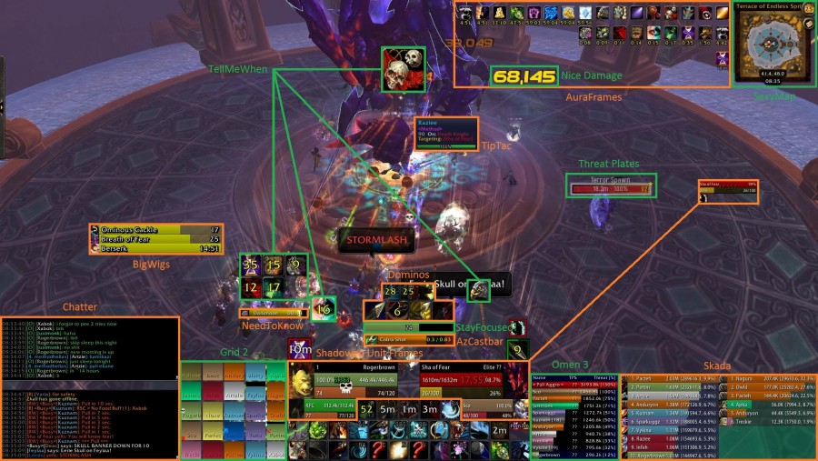
As many of you know, RogerBrown is a top Hunter in the guild Method. I gave his UI a try midway through Mists.
I really wanted this to work for me because Roger is an awesome Hunter and a really great guy.
Unfortunately, it just didn’t work for me. It’s to busy and too visual. I couldn’t keep track of everything.
I complained about Kripp’s UI being too textual, so clearly for me I need a good mix of both.
If you’re interested in trying RogerBrown’s UI, you can find it here.
Chances of an out-of-the-box solution working 100% for you is rare. A UI is a very personal thing. Even if an author makes their’s available to the general public the fact remains that the UI was ultimately built by that individual for their own use.
Every timer, every addon, the placement of each bar and unit frame, all done to help them play the game; not you. You may have to customize.
Buy and Customize
This is the approach I took. Install a pre-buitl UI and then destroy it. Mwahaha.
Be forewarned this can be almost as time consuming as building a UI from scratch.
You may find yourself adding addons that were not part of the original package and then trying to squeeze them in.
You could spend a lot of time trying to track down a behavior you wish to change because you’re not sure which addon it’s coming from or how it’s set.
If the UI author happens to be technically savvy you might find that they’ve gone into the LUA code and modified some of the addons.
I spent the better part of this weekend working on my UI, and I don’t know that I’m finished, and It’s still somewhat untested.
Whatever approach you take, here are dos and don’ts to follow when changing your UI.
Dos and Don’ts
- Do familiarize yourself with every option and setting for every addon you have.
- Don’t change your UI on raid night.
- Do take it for a spin in LFR.
- Don’t run LFR. Ever!
- Do take a video of your new UI in action.
- Do review that video and take note of alerts, notifications, things you might have missed when your cat jumped up on your desk and decide to take out the boss himself.
- Don’t give up on it too soon. Your new UI will take some getting used.
- Do completely back up your WTF and Interface folders. You’ll need them if you want to rollback.
- Don’t be surprised if your UI scale needs to be adjusted.
- Don’t be surprised if you lose your keybinds or character specific macros.
- Don’t modify your UI while the server are under a DDoS attack and you get disconnected every five minutes.
Building a UI can be a time consuming, but rewarding experience. When you’re playing the game without noticing it’s there, then you’ll know you’ve done it right.

Nice post. I kept my UI pretty bare bones in Mists (at least visually). There was a lot of stuff running under the hood in terms of Weakauras, timers, etc. but I mostly used default bars and unit frames. I plan on getting a little more fancy in 6.0 though. I’ll have plenty of time in the pre-patch to get things sorted. This is helpful.
Thanks. The PTR is a good place to try things out too. Assuming the addons are updated properly.
Another pre-made package I have been trying can be found here:
http://www.wowinterface.com/downloads/info20902-XanadarsHunterUI.html
Needed some changes, but they were pretty minor, nice balance and not too busy.
That’s a very nice looking UI as well. Thanks for posting the link.
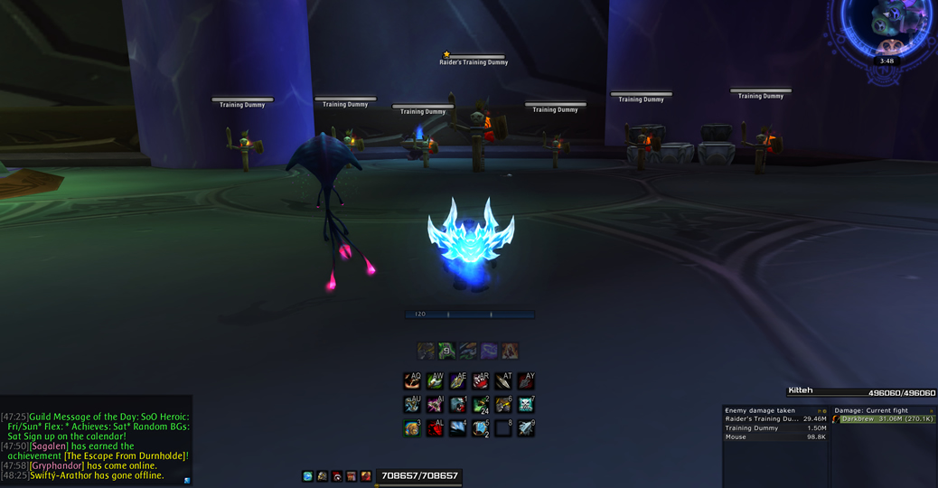
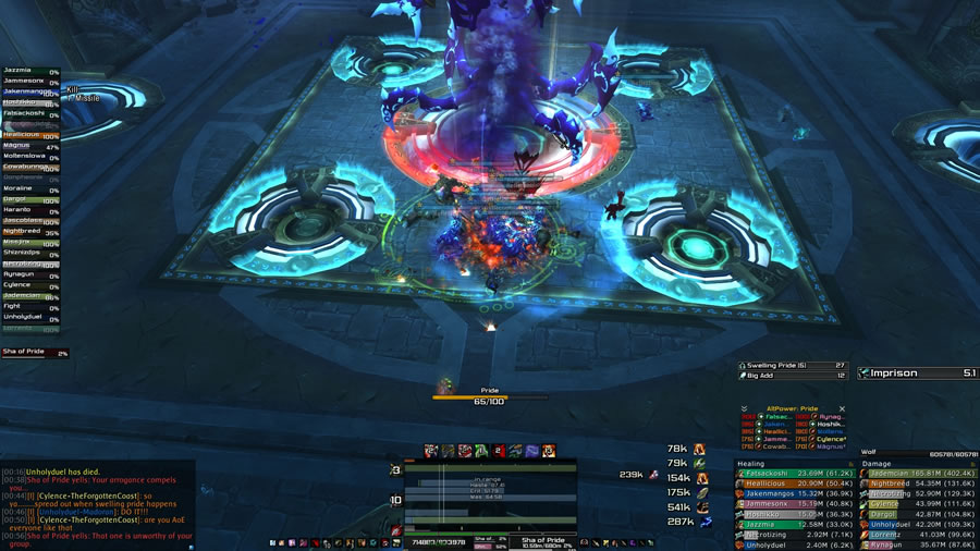
Aw, you should give EventHorizon a whirl with the icons still in-tact 🙂
I ripped mine out because I knew the order well enough. My 6.0.2 upload put the icons back until I get used to the new order I put the spells in, and when I decide if I want to use Sniper Training on a weakaura or on EH.
It’s not for everyone of course, but if mine was the only one you tried you might still like it after all!